GoodRX: Subscription
Making a sensitive purchase feel simple
Role:
Senior Product Designer
Team:
Product Manager
Content Designer
UX researcher
Launched:
May 2025
Recognition:
2025 DANDA Platinum Award
Overview
GoodRx serves about 30 million customers a year, mostly through one-off prescription discounts. In 2025 it launched its first subscription: online visits with licensed providers, prescriptions and discreet home delivery in one monthly plan, starting with erectile dysfunction treatment against Hims and Roman.
My Role
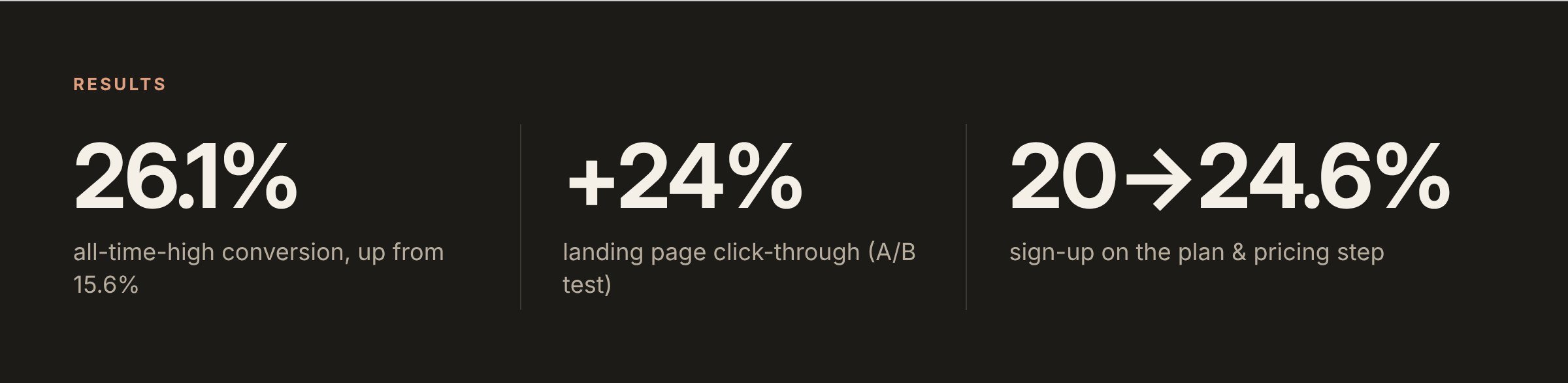
I led designs on GoodRX’s first end-to-end subscription platform that bundles telehealth, prescription management and discreet home delivery - all in one flow, taking it from a 0—>1 launch to an all-time-high 26.1% conversion.
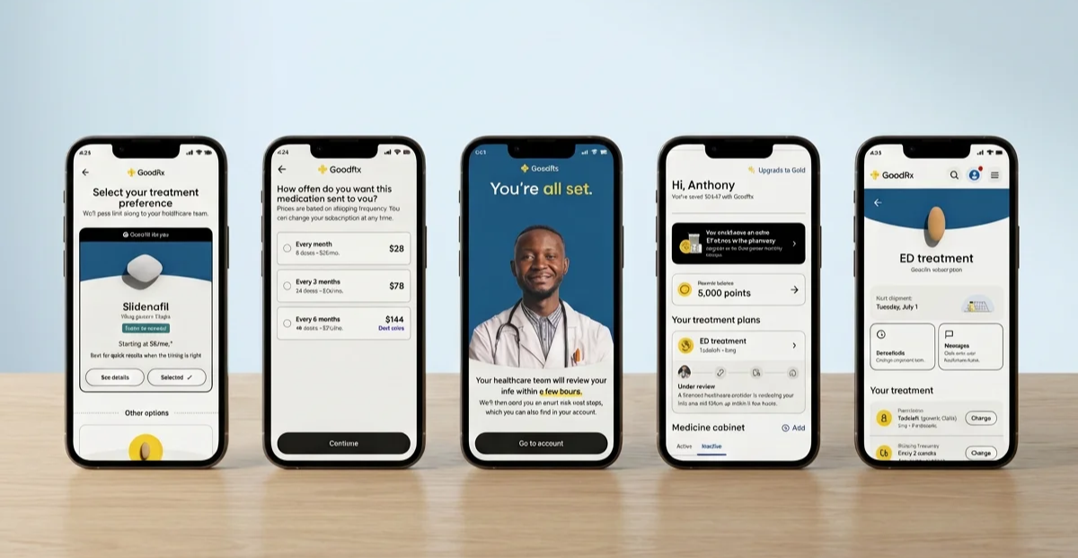
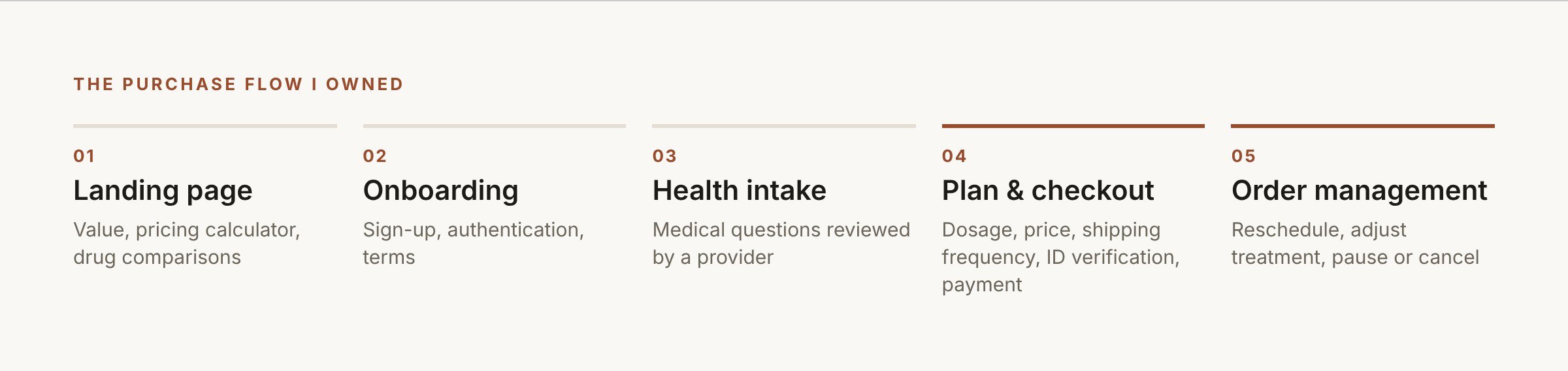
I owned the flow end to end: landing page, onboarding, health intake, plan and checkout, and the subscriber dashboard. Checkout had to handle product and dosage choice, shipping frequency, ID verification and payment, with every screen reviewed by legal and clinical.
In collaboration with our design systems team, I also built reusable surfaces and components for the entire subscription and onboarding experience that became the blueprint for treatment programs including Erectile Dysfunction, GLP‑1s, Hair Loss, and Skin Care. This was a cost-saving strategy for our product organization to instead of rebuilding the stack.
Delivering the subscriber experience
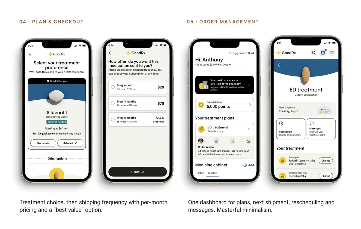
Plan and checkout:
choose a treatment, then a shipping frequency with clear per-month pricing and a "best value" option.
Order management:
one dashboard for plans, next shipment, rescheduling and messages.
Built as a platform:
shared onboarding, intake and subscription structure, so new treatment lines launch by swapping content, not rebuilding screens.
Backend Integration:
We connected to our telehealth partners and doctors using APIs, building a complete onboarding flow that synced with health questionnaires, PCP approval, and order fulfillment. The user journey takes the users to a condition-aware dashboard for Telehealth subscription.
Finding the leaks
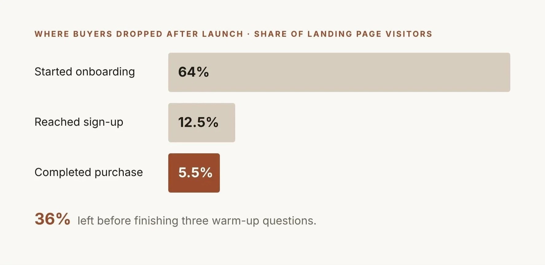
Shortly after our very first launch, we look at our performance across the subscription flow.
Our findings:
36% of users left before finishing three warm-up questions, and the landing page itself lost 86.3% of visitors.
Hypothesis
Our telehealth subscription is a brand new service, so there is natural hesitance for users to enroll. The effects are magnified with the health warnings, screening questionnaires and “warm up” pages that bloat the onboarding. By cutting the screens and shortening legal jargon, the new flow reduces friction in the enrollment process and increase conversion numbers by >3%.
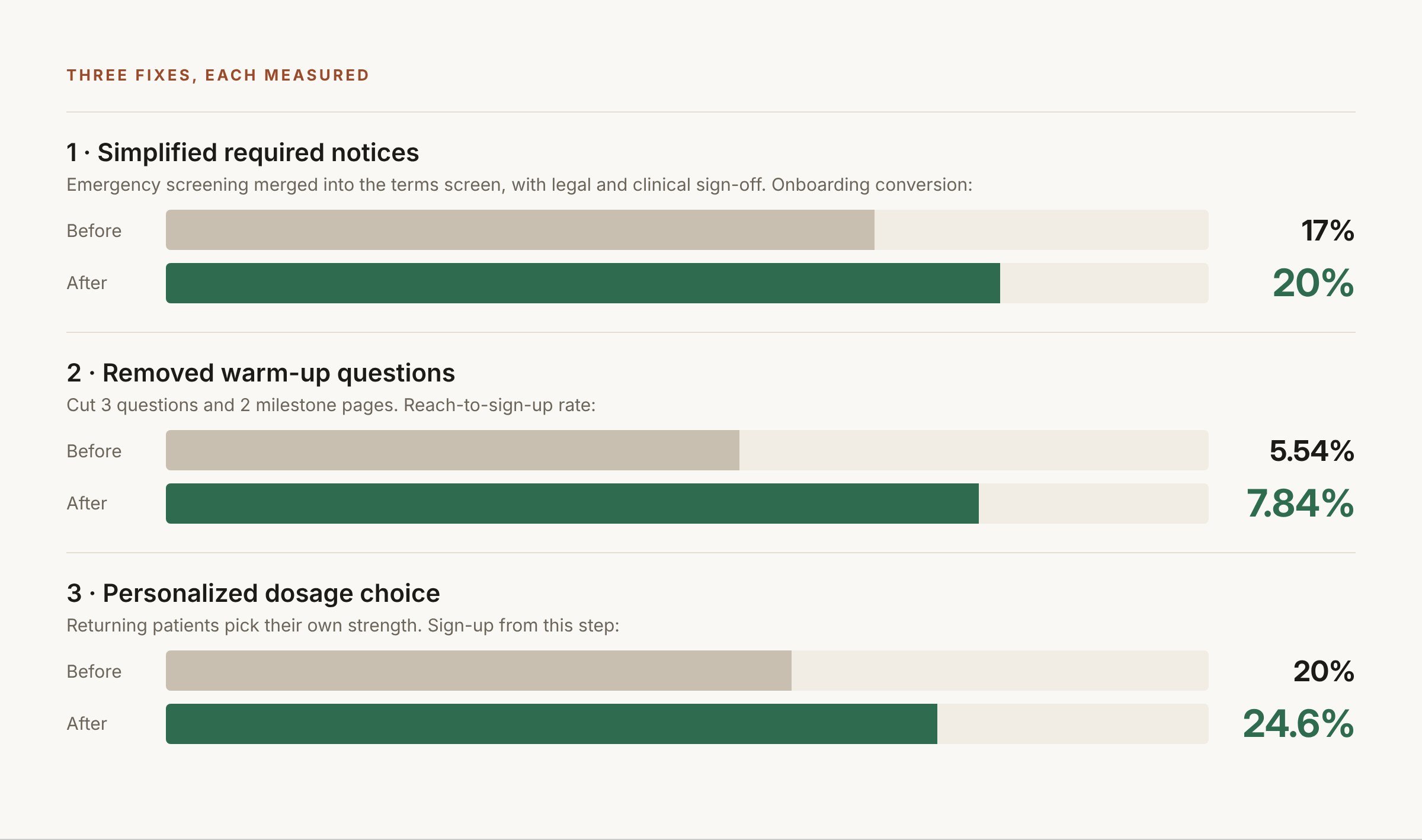
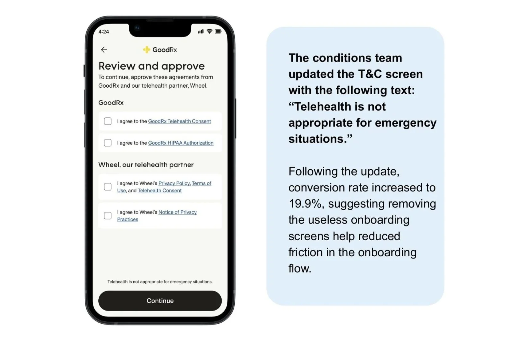
Simplified emergency warning + T&Cs
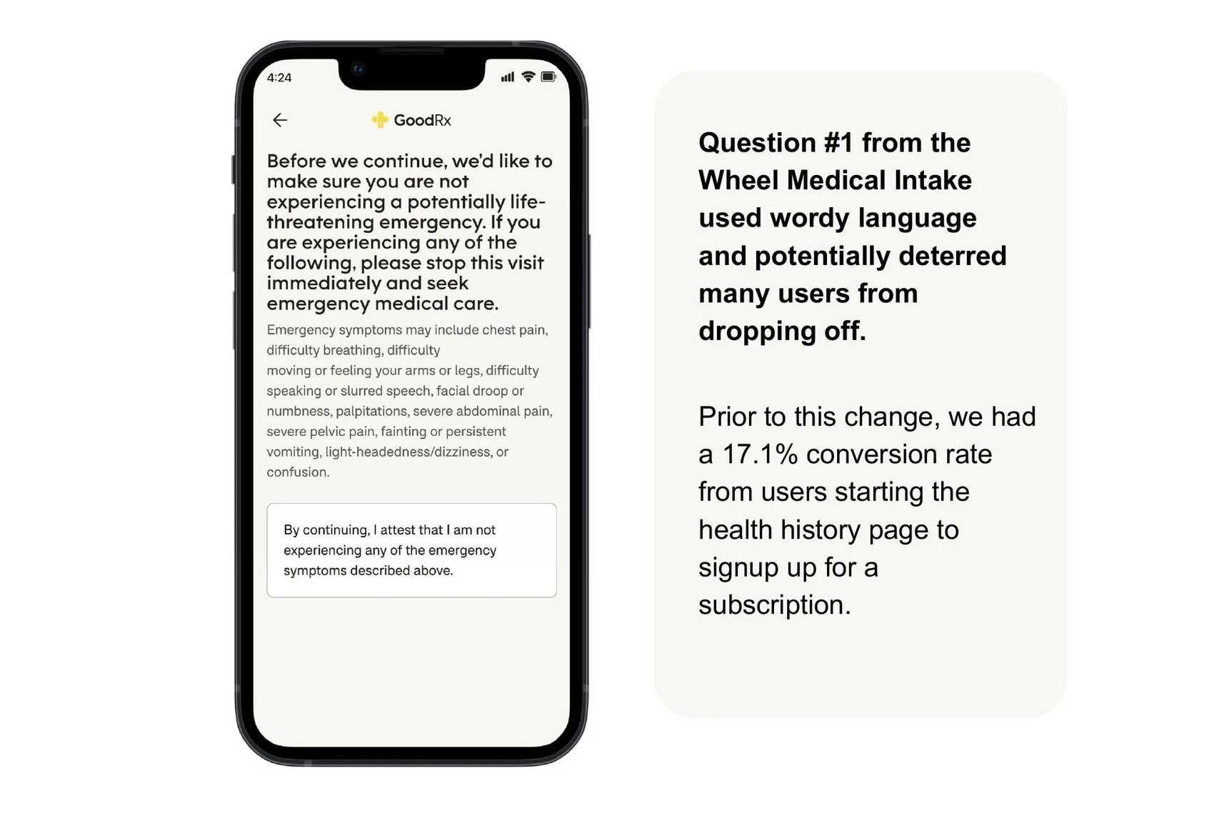
Legal needed an emergency-screening question, but it read as alarming early in the flow. I proposed merging it into the terms screen with tappable details: same legal coverage, better placement. Onboarding conversion went from 17% to 20%.
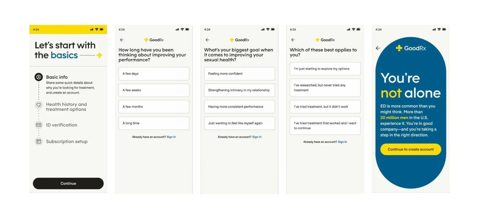
Removed warm-up questions
Cut 3 questions and 2 milestone pages. Reach-to-sign-up went from 5.54% to 7.84%.
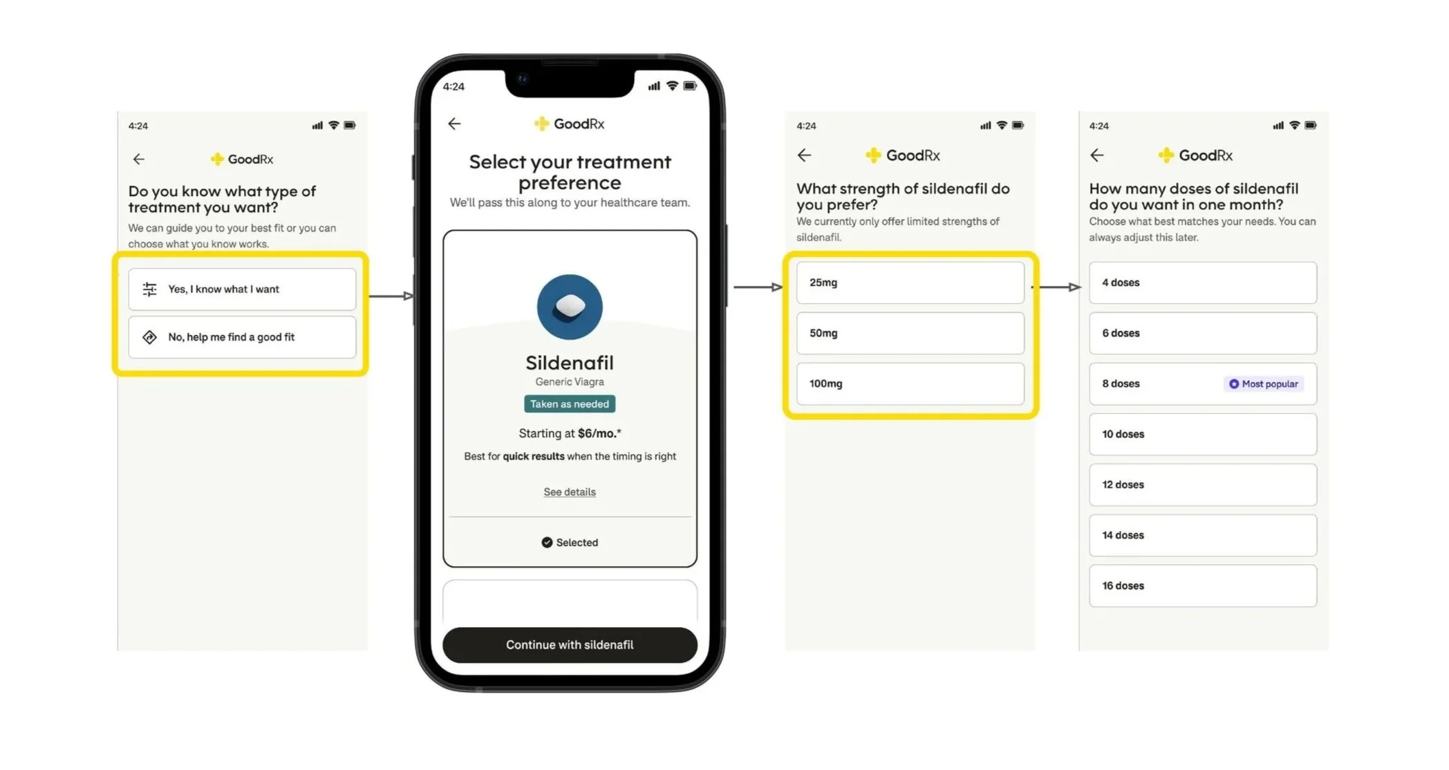
Personalized dosage choice
Returning patients felt boxed in by 3 fixed options, so I added a path to pick their own strength. Sign-up from that step went from 20% to 24.6%.

A better front door
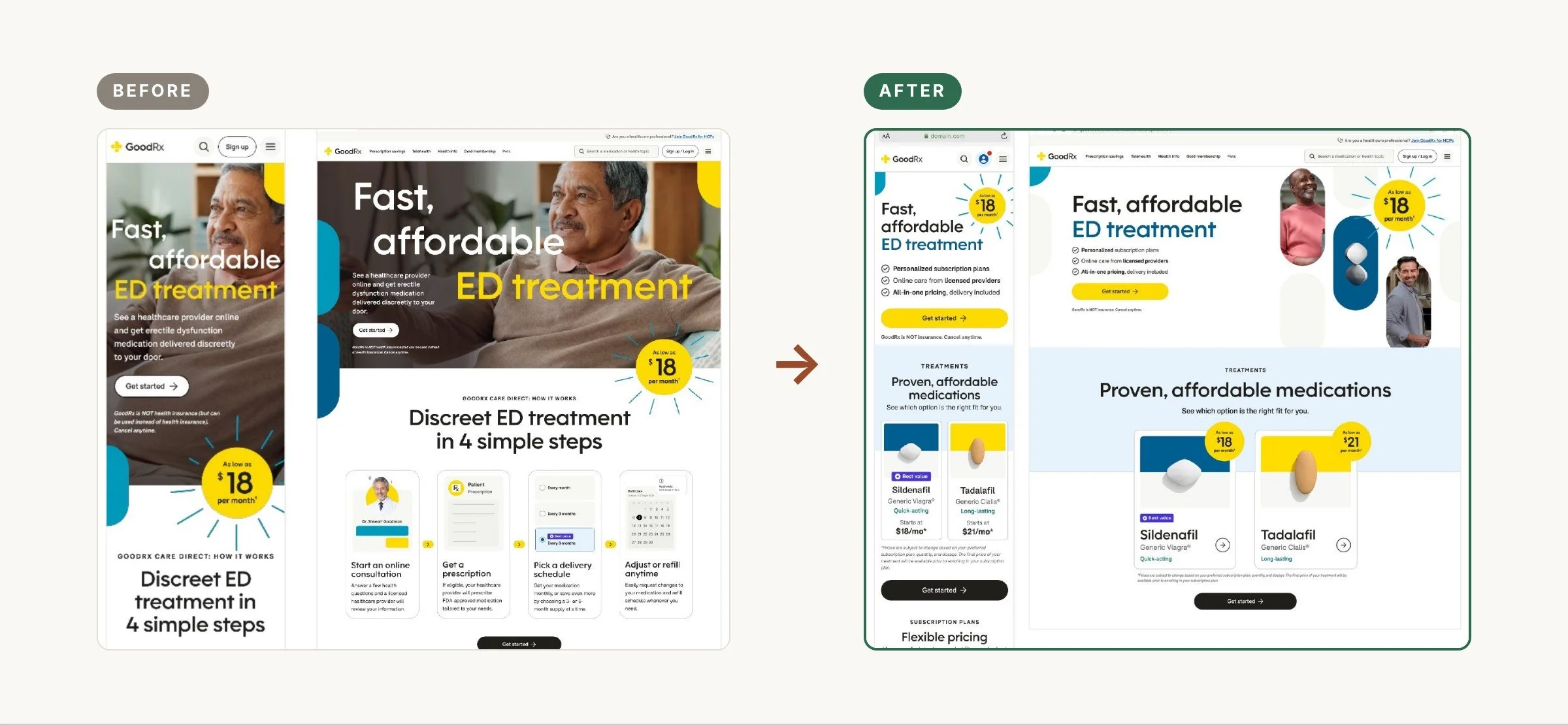
I redesigned the landing page to lead with price and value, and reorganized content based on our testing insights. User’s generally wanted upfront information on medication and pricing, not discreet services or marketing content. In addition, we’ve optimized the page to make our messages accessible and WGAC2 Compliant.
In our A/B test, click-through jumped 24%, and once we shipped the new subscription lander, the conversion reached an all-time high of 26.1%, surpassing the 15.6% improvement in A/B testing.